


The design of South Korea’s flag looks really modern and postwar to me, but in fact the core version was designed and finalized from 1882 to 1883 as the flag of Korea. It included all the current elements even then.

From: “Flags of Maritime Nations,” 1882, US Navy via Wikimedia
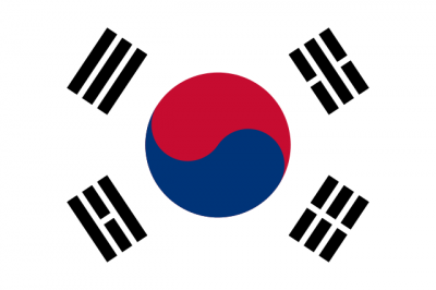
The design was immediately revived in 1945 by locals as the ruling Japanese Empire surrendered to the Allies, and subsequently had only relatively small, stylistic revisions under US military rule in the south, and again in 1948 after independence. Exact color shades were officially set in 1997 but are roughly still the same as the 1883 colors. The 1948 design is the one in use today:
I think maybe the new ratios, angles, precision shapes, proportions, and distances are what make the original late-19th century version into a sort of modernist vibe.
.svg)
Credit: Ksiom – Wikimedia
This is the flag equivalent of the Futura typeface. Look at those incredibly precise spacings and lengths radiating across every element. And those exact angle alignments that match every part to every other part! It’s an elegant simplicity with no fluff. Yet they still manage to pack a tremendous amount of cultural symbolism into the flag’s five components. Bravo.