


The New York Times has put out a cool interactive map of unemployment by US counties, as of December 2008 (Feb 09 unemployment was at 8.1%):
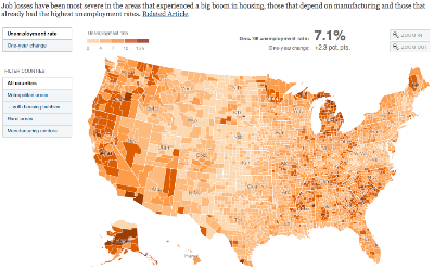
Click on the map to go to the full graphic.
There is, however, a major problem with this map that limits its overall usefulness. It’s great for just looking at how this particular recession is hitting various regions, which is what it was made for, but it’s concealing other issues. The graphic’s caption states, “Job losses have been most severe in the areas that experienced a big boom in housing, those that depend on manufacturing and those that already had the highest unemployment rates.” And it’s true that you can see this from the map. But that’s not good enough to get a real picture of current unemployment.
The map is based off what’s called U3 unemployment by the US Bureau of Labor Statistics, which is the “official” number. Since the recession in the early 1990s, this measure has been reworked for political reasons and is still the one that the media uses to report unemployment figures (released the first Friday of each month). U3 unemployment only counts a person as unemployed if they have been looking for a job sometime within four weeks of the time of the survey, which means that if people have given up looking for work, they don’t get counted as unemployed under U3.
Look at the map and notice that, with the exception of the perpetually dying state of Michigan, the Rust Belt areas of Pennsylvania/Ohio/Illinois/Indiana/etc don’t really seem too bad in terms of unemployment. If you were to go there right now, you would find massive economic devastation and chronic joblessness almost everywhere in the Rust Belt, where the industrial/manufacturing jobs have been flowing out of the country for years. The disconnect between reality on the ground and the map above is because of U3’s insistence on discounting people who have just given up altogether because there are no jobs, so there’s no reason to bother looking. People who are not looking but could work, haven’t looked recently but could work, and people who are working part-time (because the economy can’t sustain as many full-time jobs as workers want) all fall under various categories that are not included in the official rate, U3.
If you have ever wondered why unemployment during good times is so high in many European nations, compared to the US, you weren’t considering the way unemployment is measured in each place. It’s pretty difficult to compare unemployment statistics between nations because every government counts it differently. But Republican politicians frequently deride high French unemployment and blame it on SOCIALISM (!!!!) to score political points. Let’s look deeper.
The 2008 Bureau of Labor Statistics estimate for the average unemployment for the whole year was 5.8% U3 unemployment. France had a 7.4% estimated unemployment for the year. At the moment, of course, with the recession, the US rate climbed to 8.1% and France’s has presumably also climbed. But if we now add back all the other folks excluded in the official rate, as described above, the US rate jumps up. The U4, U5, and U6 rates add in more and more groups, until we come up with an accurate portrayal of the unemployment/underemployment situation. The U6 unemployment figure for the US currently stands at 14.8% nationwide, and even one year ago before the recession got going, it was a full 4.3 points higher than the “official rate” of 5.2% U3 unemployment. At that point, the French figure doesn’t look too bad.
So, what exactly does the U6 rate measure and why is it important to understand? The BLS describes U6 thus:
Total unemployed, plus all marginally attached workers, plus total employed part time for economic reasons, as a percent of the civilian labor force plus all marginally attached workers.
NOTE: Marginally attached workers are persons who currently are neither working nor looking for work but indicate that they want and are available for a job and have looked for work sometime in the recent past. Discouraged workers, a subset of the marginally attached, have given a job-market related reason for not looking currently for a job. Persons employed part time for economic reasons are those who want and are available for full-time work but have had to settle for a part-time schedule.
From what I’ve read, this is very comparable to how the French government measures its national unemployment rate. It’s more honest, but it’s disheartening. It’s politically expedient to quote the U3 figure and move on to praising the American way. It’s also taken me WAY too long to explain this, which is why when the unemployment data comes out, only the official rate makes the news. What anchor wants to explain U6?
But when the official reports say we had only 7.2% national unemployment in December, it makes the map above look much better and much less permanent, and it means we don’t have to worry about the parts of the country that are often doubly and chronically worse off in joblessness. In reality, we’ve reached nearly 15% unemployment.
This post originally appeared on Starboard Broadside.