This is one of those issues that I’ve been hammering away on since March: that the US government doesn’t count folks as officially unemployed if they’ve given up looking for work. The New York Times had a story on this yesterday, featuring the stories of several such people. One quotation from a master carpenter living in Florida stuck out at me as a good analogy for the situation…
“When you were in high school and kept asking the head cheerleader out for a date and she kept saying no, at some point you stopped asking her. It becomes a ‘why bother?’ scenario.”
The government’s Bureau of Labor Statistics, as I’ve now said several times on this blog, publishes the U3 unemployment number as the official national unemployment statistic, which is what the media quotes every month. But the U3 ignores the folks in that article above who’ve given up looking because there just aren’t any jobs to be found. The U6 figure from the BLS is a broader measure that does take that into account, as well as including people who are underemployed (i.e. they can’t find as much work as they need because of jobs/hours scarcity). To quote myself from the end of July:
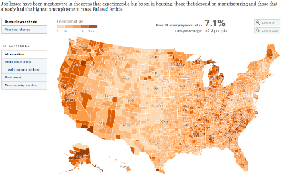
Some people may think the distinction doesn’t matter and is just semantics, but in the June data, the official rate was 7 points lower than the more accurate U6 rate of 16.5% unemployed nationally. Using the U6 unemployment rate, which used to be the definition of official unemployment until 1994, we can see that we have the worst unemployment since the Great Depression (not since merely the 1980s as the media insisted for a while. Making sure people understand the severity of the situation is the difference between pressure for critical government efforts to save the economy and spur recovery and public pressure to reduce the deficit and debt in the middle of a gigantic recession. The latter has been the worrying trend recently. And once we get out of this mess, U6 versus U3 is the difference between helping Michigan and the Rust Belt states climb out of their semi-permanent hole that existed prior to the recession and continuing with business as usual. 13% in Michigan looks much better than 22% unemployed. The post-recession part may be even more important, in terms of helping Americans in chronic localized recession.
I once again commend the Times for looking into this, but the government is fundamentally misrepresenting the national economic situation to make things look better than they are, and that’s hamstringing the ability to implement good policy to fix things. The American media, as a whole, remains complicit in this fudge. I recognize that it would confuse everyone to have the national unemployment figure suddenly spike by changing it back to the pre-1994 way of measuring things (essentially what the U6 now measures), but millions of Americans are affected by this directly and indirectly; so it helps none of us to keep pretending things are much rosier than they are.
In August, the official U3 unemployment rate was 9.7%, while the U6 rate was 16.8%.
This post originally appeared on Starboard Broadside.