“CIA official: no proof harsh techniques stopped terror attacks”

Oh? That headline comes from McClatchy DC:

WASHINGTON — The CIA inspector general in 2004 found that there was no conclusive proof that waterboarding or other harsh interrogation techniques helped the Bush administration thwart any “specific imminent attacks,” according to recently declassified Justice Department memos.

That undercuts assertions by former vice president Dick Cheney and other former Bush administration officials that the use of harsh interrogation tactics including waterboarding, which is widely considered torture, was justified because it headed off terrorist attacks.

 
Unsurprising. Didn’t know it had been found codified yet in an official document. There was a Bush speech in 2006 that explains that a foiled 2002 plot was later identified by torturing KSM in 2003, suggesting that some information was gained but not anything vital or time-sensitive that stopped an attack. The 183 waterboardings just explained to the CIA which plot had been stopped previously by a local arrest of an Al Qaeda agent.

By the way, I skimmed and read parts of the 2005 Bradbury memo, which the McClatchy article above mentions later as citing (and contradicting) the 2004 memo. I didn’t get to that part yet, but I’ll check into it.

This post originally appeared on Starboard Broadside.

Torture “safety measures”

More disturbing discoveries in the torture memos: doctors were on hand with equipment to perform emergency tracheotomies on detainees in case they stopped breathing properly due to extensive water boarding.

You know, where they cut a hole in your throat so you can get enough air not to die.

I don’t understand how people can still insist this wasn’t torture.

I’ve crawled through several sections of the 2005 memo cited (pdf) myself now. The tracheotomy part can be found in the second paragraph of page 14. (I actually read the memo backward for some reason, but this particular part is on p. 14). I’ve also found from reading it that these rules were created pretty much in response to worse torture before this, such as the repeated waterboarding of KSM 183 times in one month… though they don’t acknowledge that.

This post originally appeared on Starboard Broadside.

Make sure to see this…

I was away when this story broke, or I would have covered it in more detail, but I want to make sure people read about this story. It was first broken by “emptywheel” on Firedoglake and then picked up by the New York Times.

According to the May 30, 2005 Bradbury memo, Khalid Sheikh Mohammed was waterboarded 183 times in March 2003 and Abu Zubaydah was waterboarded 83 times in August 2002.

 
That’s mind-boggling. It’s almost impossible to understand how that amount of torture was accomplished mathematically, let alone the moral implications.

Most important note of all: No information was gained.

This post originally appeared on Starboard Broadside.

Deficit Levels

This video was on the front page of Daily Kos mainly to highlight what the author saw as betrayal by Sen. Evan Bayh on FOX News, where he explained why he planned to vote against the Federal spending bill that runs budget programs. I’m not, however, posting it here for that reason, as you’ll read below the video.

If he and other deficit hawks stopped for a moment to consider what they are actually saying, they might realize they were making the case FOR increased deficit spending. He cites the Civil War and WWII as the only times when he thinks the deficit-to-GDP ratio was higher than now (Bayh thinks it’s 12% of GDP right now, and by the end of WWII it was over 100% of GDP).

Ok, setting the Civil War aside because that brings up unrelated issues, let’s examine the issue of citing World War II deficits. Right now, we’re in a major recession. It’s the worst since the Great Depression (1929-1942ish). Now, we trundled along from 1929 to the US entry to war worrying about deficits and not spending too much compared to the national GDP, which was much smaller then than it is now. No amount of New Deal programs worked until 1942, when the New Deal went on Allied War Effort steroids. That doesn’t mean the New Deal failed because it was useless, it means it didn’t succeed because it didn’t go far enough.

World War II came along and we went WAY into debt and spent at a federal budget deficit exceeding the entire gross domestic product of the United States. This money went to buy and build weapons, pay factory workers, expand the bureaucracy, pay soldiers, overhaul the manufacturing industry, and increase government control over the American Total War Economy. Our long malaise and stupor finally broke and we emerged out the other side of the war on an economic crest (which temporarily dampened as spending and price controls were slashed rapidly by a Republican-run Congress). But the Great Depression was finally over and we didn’t go back to it. Without the extreme wartime spending, though, it’s probably safe to say the Depression would have continued longer.

While the debt was never entirely paid off, the deficit and debt levels were both brought reasonably quickly back under control, and they largely remained that way for the rest of the 20th century. By the time President George W. Bush took office, we were still paying down the national debt, but the spending was close to par with the revenue. No harm done.

Obviously, in the very long run, World War II-level spending would be unsustainable, but it was only meant for the short-term. Evan Bayh clearly makes an exception to his deficit concerns “rule” when he cites World War II…which came after/during the Great Depression and ended it permanently. That means that he knows it’s critical to act by massive government spending for a few years. There are exceptions to his rule, and he knows it, but doesn’t connect the dots.

Aren’t we in exceptional times right now?

This post originally appeared on Starboard Broadside.
Denmark: F@#$ YEAH!

If you were to ask me what my favorite country in the world is (besides the US of course, ILYSM) I would definitely pick Denmark. I have visited Denmark several times and I have some Danish friends, and I have got to say it is pretty cool in lots of ways. They are masters of alternative energy, particularly wind power (the world’s biggest wind turbine company, Vestas, is Danish). They have supertrains everywhere that completely put the “T” and Amtrak to shame. The entire country is bike friendly and there are bike lanes on pretty much every road (I would know – I’ve biked across the country). The Danes are a warm, socially tolerant, friendly, and beer-loving people. (Oh, and full disclosure, my uncle was the US Ambassador to the country in the 90s). But there’s another reason why Denmark is kickass: its economy.

John Cohn at TNR explains that America isn’t turning French, its turning Danish, and why this is good. (Video no longer available. Sorry! -ed.)

Cohn also wrote a terrific piece about Denmark in TNR two years ago. It’s not on the website anymore (TNR has sucky archives), but I found it.

If you believe the conservative rhetoric on economics, this combination of high taxes, a large public sector, and lavish welfare benefits ought to be killing the Danish economy. But it’s not. In fact, Denmark’s economy has thrived. And nowhere is that more apparent than in the job market. By the time Rasmussen left office in 2001, the unemployment rate had fallen from a 1994 peak of 9.6 percent to 4.3 percent; in 2002, it fell below the U.S. rate, where it has remained ever since. For the most recent quarter of 2006, Denmark’s standardized unemployment rate was 3.6 percent, compared with 4.7 percent in the United States. Moreover, while Europe has a reputation for fostering cadres of idle youth (a reputation that, in countries like France, has at least some basis in reality), in Denmark, a mere 3 percent of its 15- to 19-year-olds are neither in school nor working–the second-best rate in the developed world. (Tiny Luxembourg is first.) In the United States, by comparison, the figure is about 7 percent.

 
Bob Kuttner also wrote about Denmark’s pwnage in Foreign Affairs (subscriber wall, sorry).

Reading Adam Smith in Copenhagen — the center of the small, open, and highly successful Danish economy — is a kind of out-of-body experience. On the one hand, the Danes are passionate free traders. They score well in the ratings constructed by pro-market organizations. The World Economic Forum’s Global Competitiveness Index ranks Denmark third, just behind the United States and Switzerland. Denmark’s financial markets are clean and transparent, its barriers to imports minimal, its labor markets the most flexible in Europe, its multinational corporations dynamic and largely unmolested by industrial policies, and its unemployment rate of 2.8 percent the second lowest in the OECD (the Organization for Economic Cooperation and Development).

On the other hand, Denmark spends about 50 percent of its GDP on public outlays and has the world’s second-highest tax rate, after Sweden; strong trade unions; and one of the world’s most equal income distributions. For the half of GDP that they pay in taxes, the Danes get not just universal health insurance but also generous child-care and family-leave arrangements, unemployment compensation that typically covers around 95 percent of lost wages, free higher education, secure pensions in old age, and the world’s most creative system of worker retraining.

 
As these quotes make clear, the key to Denmark’s success is, the combination of dynamic, free market economies, and strong social safety nets. Of course, the US and Denmark are very different countries, so we can’t adopt these policies overnight. But Denmark’s example does point the way forward for liberals and America in the future.

This post originally appeared on Starboard Broadside.

United State of Unemployment

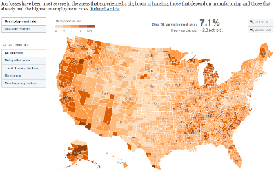
The New York Times has put out a cool interactive map of unemployment by US counties, as of December 2008 (Feb 09 unemployment was at 8.1%):
Go to feature
Click on the map to go to the full graphic.

There is, however, a major problem with this map that limits its overall usefulness. It’s great for just looking at how this particular recession is hitting various regions, which is what it was made for, but it’s concealing other issues. The graphic’s caption states, “Job losses have been most severe in the areas that experienced a big boom in housing, those that depend on manufacturing and those that already had the highest unemployment rates.” And it’s true that you can see this from the map. But that’s not good enough to get a real picture of current unemployment.

The map is based off what’s called U3 unemployment by the US Bureau of Labor Statistics, which is the “official” number. Since the recession in the early 1990s, this measure has been reworked for political reasons and is still the one that the media uses to report unemployment figures (released the first Friday of each month). U3 unemployment only counts a person as unemployed if they have been looking for a job sometime within four weeks of the time of the survey, which means that if people have given up looking for work, they don’t get counted as unemployed under U3.

Look at the map and notice that, with the exception of the perpetually dying state of Michigan, the Rust Belt areas of Pennsylvania/Ohio/Illinois/Indiana/etc don’t really seem too bad in terms of unemployment. If you were to go there right now, you would find massive economic devastation and chronic joblessness almost everywhere in the Rust Belt, where the industrial/manufacturing jobs have been flowing out of the country for years. The disconnect between reality on the ground and the map above is because of U3’s insistence on discounting people who have just given up altogether because there are no jobs, so there’s no reason to bother looking. People who are not looking but could work, haven’t looked recently but could work, and people who are working part-time (because the economy can’t sustain as many full-time jobs as workers want) all fall under various categories that are not included in the official rate, U3.

If you have ever wondered why unemployment during good times is so high in many European nations, compared to the US, you weren’t considering the way unemployment is measured in each place. It’s pretty difficult to compare unemployment statistics between nations because every government counts it differently. But Republican politicians frequently deride high French unemployment and blame it on SOCIALISM (!!!!) to score political points. Let’s look deeper.

The 2008 Bureau of Labor Statistics estimate for the average unemployment for the whole year was 5.8% U3 unemployment. France had a 7.4% estimated unemployment for the year. At the moment, of course, with the recession, the US rate climbed to 8.1% and France’s has presumably also climbed. But if we now add back all the other folks excluded in the official rate, as described above, the US rate jumps up. The U4, U5, and U6 rates add in more and more groups, until we come up with an accurate portrayal of the unemployment/underemployment situation. The U6 unemployment figure for the US currently stands at 14.8% nationwide, and even one year ago before the recession got going, it was a full 4.3 points higher than the “official rate” of 5.2% U3 unemployment. At that point, the French figure doesn’t look too bad.

So, what exactly does the U6 rate measure and why is it important to understand? The BLS describes U6 thus:

Total unemployed, plus all marginally attached workers, plus total employed part time for economic reasons, as a percent of the civilian labor force plus all marginally attached workers.

NOTE: Marginally attached workers are persons who currently are neither working nor looking for work but indicate that they want and are available for a job and have looked for work sometime in the recent past. Discouraged workers, a subset of the marginally attached, have given a job-market related reason for not looking currently for a job. Persons employed part time for economic reasons are those who want and are available for full-time work but have had to settle for a part-time schedule.

 
From what I’ve read, this is very comparable to how the French government measures its national unemployment rate. It’s more honest, but it’s disheartening. It’s politically expedient to quote the U3 figure and move on to praising the American way. It’s also taken me WAY too long to explain this, which is why when the unemployment data comes out, only the official rate makes the news. What anchor wants to explain U6?

But when the official reports say we had only 7.2% national unemployment in December, it makes the map above look much better and much less permanent, and it means we don’t have to worry about the parts of the country that are often doubly and chronically worse off in joblessness. In reality, we’ve reached nearly 15% unemployment.

This post originally appeared on Starboard Broadside.