Big Business is now creating chronic U.S. underemployment

One of the perennial problems in accurately measuring the U.S. labor market is how to handle “underemployment” or involuntary part-time employment by people who want to be working full time. The official Bureau of Labor Statistics defines this category as follows:

Persons employed part time for economic reasons are those who want and are available for full-time work but have had to settle for a part-time schedule.

 
Those people, whether working 30 hours a week or 10 hours a week, even at or near minimum wage, are ineligible for unemployment insurance benefits or virtually any other program that would help someone who was completely jobless. Any paying work at all, even when it’s not enough to make ends meet, usually kicks people out of eligibility for such programs.

More than five years after the peak of the 2007 U.S. recession, many Americans find themselves in this category of being “employed part time for economic reasons.” The U6 measure of unemployment, which factors these people into the official rate, stood at 12.1% in June 2014 — just shy of being double the official unemployment rate. Almost 7 in 10 part-time workers right now would like to work full-time.

The decision to leave underemployed people out of the official unemployment figures, as I’ve been arguing for five years, has probably been a major factor in not recognizing the severity of many of the emerging structural problems in the part-time work arena that ripple back into the wider consumer economy negatively. Instead, we were busy congratulating ourselves for two decades on supposedly having much “lower” unemployment than Western European economies.

Those economies, which generally use comprehensive definitions of unemployment much closer to our U6 metric, were rarely substantially higher than our U6 rate of unemployed plus involuntarily underemployed persons. Moreover, their “unemployed” people were, in fact, often working part-time (legally or illegally) at rates the same as or higher than our labor force was. So their unemployed/underemployed populations were in far less dire straits than ours during the same period, even without getting into the differences in social safety nets.

Let’s examine one of the big emerging problems that such measurement definitions helped obscure: Involuntary part-time employment for corporate profit reasons, rather than genuine economic reasons.

Often, at least in the past, the “economic reasons” for the lack of full hours came in the form of hours cutbacks (in place of mass layoffs) or general economic belt-tightening, during economic contractions/slowdowns/recessions, by those in positions to be hiring. That’s especially true at the small-to-medium business level.

But a far more insidious and damaging trend has exploded on to the scene from the Big Business end of the spectrum, as huge American corporations not only decline to hire more and more of their hourly wage workforce for full workweeks but then demand these part-time workers be “on-call,” without compensation, to work at virtually any hour, day or night, seven days a week. The schedule changes from week to week and from day to day, at the discretion of the corporate managers.

Almost half of all part-time workers, according to the Times, now have one week or less of advanced notice on their schedule. Among 26-32 year olds working part time, that figure is 47%. Beyond young workers, this problem disproportionately affects women and non-white workers.

In an ongoing series of articles from the New York Times examining the prevalence and consequences of this pernicious staffing practice, we can read example after example of people being forced not only to work part-time but to be available full-time without pay to work the paid hours, which prevents workers from taking second jobs to supplement their hours or finding a better/full-time job or completing their education. Here is one testimonial:

“You had to be available every minute of every day, knowing you would be scheduled for no more than 29 hours per week and knowing there would be no normalcy to your schedule,” he wrote. “I told the person I would like to be scheduled for the same days every week so I could try to get another job to try to make ends meet. She immediately said, ‘Well, that will end our conversation right here. You have to be available every day for us.’

“I asked, ‘Even though I’m trying to get another job?’ ‘Yes.’ Then she just stared at me and asked me to leave. What kind of company does this? What kind of company will not even let you get another job?”

  Read more

Giving up on job-hunting

This is one of those issues that I’ve been hammering away on since March: that the US government doesn’t count folks as officially unemployed if they’ve given up looking for work. The New York Times had a story on this yesterday, featuring the stories of several such people. One quotation from a master carpenter living in Florida stuck out at me as a good analogy for the situation…

“When you were in high school and kept asking the head cheerleader out for a date and she kept saying no, at some point you stopped asking her. It becomes a ‘why bother?’ scenario.”

 
The government’s Bureau of Labor Statistics, as I’ve now said several times on this blog, publishes the U3 unemployment number as the official national unemployment statistic, which is what the media quotes every month. But the U3 ignores the folks in that article above who’ve given up looking because there just aren’t any jobs to be found. The U6 figure from the BLS is a broader measure that does take that into account, as well as including people who are underemployed (i.e. they can’t find as much work as they need because of jobs/hours scarcity). To quote myself from the end of July:

Some people may think the distinction doesn’t matter and is just semantics, but in the June data, the official rate was 7 points lower than the more accurate U6 rate of 16.5% unemployed nationally. Using the U6 unemployment rate, which used to be the definition of official unemployment until 1994, we can see that we have the worst unemployment since the Great Depression (not since merely the 1980s as the media insisted for a while. Making sure people understand the severity of the situation is the difference between pressure for critical government efforts to save the economy and spur recovery and public pressure to reduce the deficit and debt in the middle of a gigantic recession. The latter has been the worrying trend recently. And once we get out of this mess, U6 versus U3 is the difference between helping Michigan and the Rust Belt states climb out of their semi-permanent hole that existed prior to the recession and continuing with business as usual. 13% in Michigan looks much better than 22% unemployed. The post-recession part may be even more important, in terms of helping Americans in chronic localized recession.

 
I once again commend the Times for looking into this, but the government is fundamentally misrepresenting the national economic situation to make things look better than they are, and that’s hamstringing the ability to implement good policy to fix things. The American media, as a whole, remains complicit in this fudge. I recognize that it would confuse everyone to have the national unemployment figure suddenly spike by changing it back to the pre-1994 way of measuring things (essentially what the U6 now measures), but millions of Americans are affected by this directly and indirectly; so it helps none of us to keep pretending things are much rosier than they are.

In August, the official U3 unemployment rate was 9.7%, while the U6 rate was 16.8%.

This post originally appeared on Starboard Broadside.

New York Times finally gets it

While studying an unemployment graphic by The New York Times back in March, I observed that they (like the rest of the traditional media) were ignoring the fact that the quoted national unemployment statistic (U3) is too limited in its definition. For example, it excludes all the people who’ve simply given up looking for work because there just aren’t any jobs in the area. This makes employment look far better than it really is, and it helps boost the stupid claims that western Europe’s national unemployment rates are far higher than ours. I showed that using the lesser-known U6 Bureau of Labor Statistics measurement of unemployment, which I explain fully in that post, US and Western Europe have very comparable unemployment most of the time.

This month, finally, the NY Times posted a state-by-state interactive graphic that confirms what many bloggers (including me) have been saying for quite some time: unemployment is much worse than many people realize. The new graphic shows the U6 rate in each state, rather than the usual and more limited U3, and for several states the unemployment is actually over 20%. Here’s a non-interactive picture of the map (click for full version):

Some people may think the distinction doesn’t matter and is just semantics, but in the June data, the official rate was 7 points lower than the more accurate U6 rate of 16.5% unemployed nationally. Using the U6 unemployment rate, which used to be the definition of official unemployment until 1994, we can see that we have the worst unemployment since the Great Depression (not since merely the 1980s as the media insisted for a while. Making sure people understand the severity of the situation is the difference between pressure for critical government efforts to save the economy and spur recovery and public pressure to reduce the deficit and debt in the middle of a gigantic recession. The latter has been the worrying trend recently. And once we get out of this mess, U6 versus U3 is the difference between helping Michigan and the Rust Belt states climb out of their semi-permanent hole that existed prior to the recession and continuing with business as usual. 13% in Michigan looks much better than 22% unemployed. The post-recession part may be even more important, in terms of helping Americans in chronic localized recession.

While I laud the Times for their graphic earlier this month, they and others need to begin incorporating the broader definition into their reporting both nationwide and state-by-state. This shouldn’t be swept under the rug had a technicality. The government won’t change the definition back, I’m sure, because it’s like rose-colored glasses for the state of the economy. But the U6 figure is out there every month, and it takes about 5 seconds more to locate on the BLS website. The media just doesn’t want to waste time explaining the distinction to people.

This post originally appeared on Starboard Broadside.

More on Unemployment

Yesterday I reminded everyone to check the U6 unemployment, which gives a better picture of the unemployment situation in this country. There’s another reason I forgot to mention, other than that it doesn’t ignore the chronically unemployed.

It’s being said that this is the worst unemployment in 26 years (which goes back to 1983). That’s true if one looks at the official rate over that period (BLS graph):

But the problem is, and I wish the old media would remember this, the official definition of unemployment changed in 1994, to exclude the chronically unemployed (who lack job opportunities in their area), which makes the situation look better. Not only does that mean that a slight decrease in unemployment does not automatically point to recovery (because people could just give up looking for a while and then be excluded), but it also means that the magnitude of the recession is ignored in media reports. Saying that this is the worst unemployment in only 26 years simply isn’t true. Using the U6 from 1994 to present and comparing that to the old official rate before 1994, which used roughly the same definition, we find that this is the highest unemployment since probably as far back as the Great Depression. This is probably the worst in 71 years.

The Bureau of Labor Statistics shows me only back to 1948, but between 1948 and 1994, the highest unemployment was in 1982, when it reached 10.8% unemployment. Compared to the present (U6) unemployment, 16.4%, it’s evident that you have to go back past 1948 to find a higher unemployment rate than now. So I’m pretty sure that means going all the way back to the Great Depression, when (if I recall correctly) unemployment reached 25% at one point. After a brief recovery, it climbed back to 19% or so in 1938.

But all that is obscured when the old media decides to ignore the 1994 definition change that artificially lowers the official unemployment rate by 7 points in the month of may.

This post originally appeared on Starboard Broadside.

US Unemployment at 16.4% (U6)

It’s the first Friday of the month, which means today’s labor report is out from the Bureau of Labor Statistics for last month. The U6 unemployment rate nationwide hit 16.4% for May 2009.

This is much higher than the normally quoted U3 rate, of course, in case that seems high to you. But as I explained when the February data came out, we should be looking at the U6 to get an accurate understanding of the situation. I encourage you to read that post, if you didn’t before, since understanding the difference between the “official rate” and the U6 rate is critical, in my opinion, to understanding the US economy, especially when we’re not in a recession.

I call the U6 “real” unemployment, just like people talk about “real” wage growth (which accounts for inflation).

This post originally appeared on Starboard Broadside.

United State of Unemployment

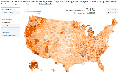
The New York Times has put out a cool interactive map of unemployment by US counties, as of December 2008 (Feb 09 unemployment was at 8.1%):
Go to feature
Click on the map to go to the full graphic.

There is, however, a major problem with this map that limits its overall usefulness. It’s great for just looking at how this particular recession is hitting various regions, which is what it was made for, but it’s concealing other issues. The graphic’s caption states, “Job losses have been most severe in the areas that experienced a big boom in housing, those that depend on manufacturing and those that already had the highest unemployment rates.” And it’s true that you can see this from the map. But that’s not good enough to get a real picture of current unemployment.

The map is based off what’s called U3 unemployment by the US Bureau of Labor Statistics, which is the “official” number. Since the recession in the early 1990s, this measure has been reworked for political reasons and is still the one that the media uses to report unemployment figures (released the first Friday of each month). U3 unemployment only counts a person as unemployed if they have been looking for a job sometime within four weeks of the time of the survey, which means that if people have given up looking for work, they don’t get counted as unemployed under U3.

Look at the map and notice that, with the exception of the perpetually dying state of Michigan, the Rust Belt areas of Pennsylvania/Ohio/Illinois/Indiana/etc don’t really seem too bad in terms of unemployment. If you were to go there right now, you would find massive economic devastation and chronic joblessness almost everywhere in the Rust Belt, where the industrial/manufacturing jobs have been flowing out of the country for years. The disconnect between reality on the ground and the map above is because of U3’s insistence on discounting people who have just given up altogether because there are no jobs, so there’s no reason to bother looking. People who are not looking but could work, haven’t looked recently but could work, and people who are working part-time (because the economy can’t sustain as many full-time jobs as workers want) all fall under various categories that are not included in the official rate, U3.

If you have ever wondered why unemployment during good times is so high in many European nations, compared to the US, you weren’t considering the way unemployment is measured in each place. It’s pretty difficult to compare unemployment statistics between nations because every government counts it differently. But Republican politicians frequently deride high French unemployment and blame it on SOCIALISM (!!!!) to score political points. Let’s look deeper.

The 2008 Bureau of Labor Statistics estimate for the average unemployment for the whole year was 5.8% U3 unemployment. France had a 7.4% estimated unemployment for the year. At the moment, of course, with the recession, the US rate climbed to 8.1% and France’s has presumably also climbed. But if we now add back all the other folks excluded in the official rate, as described above, the US rate jumps up. The U4, U5, and U6 rates add in more and more groups, until we come up with an accurate portrayal of the unemployment/underemployment situation. The U6 unemployment figure for the US currently stands at 14.8% nationwide, and even one year ago before the recession got going, it was a full 4.3 points higher than the “official rate” of 5.2% U3 unemployment. At that point, the French figure doesn’t look too bad.

So, what exactly does the U6 rate measure and why is it important to understand? The BLS describes U6 thus:

Total unemployed, plus all marginally attached workers, plus total employed part time for economic reasons, as a percent of the civilian labor force plus all marginally attached workers.

NOTE: Marginally attached workers are persons who currently are neither working nor looking for work but indicate that they want and are available for a job and have looked for work sometime in the recent past. Discouraged workers, a subset of the marginally attached, have given a job-market related reason for not looking currently for a job. Persons employed part time for economic reasons are those who want and are available for full-time work but have had to settle for a part-time schedule.

 
From what I’ve read, this is very comparable to how the French government measures its national unemployment rate. It’s more honest, but it’s disheartening. It’s politically expedient to quote the U3 figure and move on to praising the American way. It’s also taken me WAY too long to explain this, which is why when the unemployment data comes out, only the official rate makes the news. What anchor wants to explain U6?

But when the official reports say we had only 7.2% national unemployment in December, it makes the map above look much better and much less permanent, and it means we don’t have to worry about the parts of the country that are often doubly and chronically worse off in joblessness. In reality, we’ve reached nearly 15% unemployment.

This post originally appeared on Starboard Broadside.